
Critique a T-Shirt Website
My client, Mike the Frog, has asked me to help improve his e-commerce website, Shirts4Mike.com. My job as a UX Designer is to critique the website and provide a document outlining the critique and what can be done to make the site function and appear better to his customers. To complete this task successfully, I was given a link to the website.
This project taught me how to analyse a website with a critical eye. First, I described the website. Then, I employed the concepts of Visual Communication to successfully analyse and critique the work. I was able to look at the layout, color, typography and images of the website and use design theory to break it down and provide a worthwhile critique.

Complete a Wireframe
My client had asked me to design up a wireframe for their online blog. They are a company that sells baking supplies, and are branching out into blogging to focus on recipes that use the supplies that the company sells. The goal wireframe a blog that is easy to understand with logical navigation and content groupings that help recommend recipes to visitors. A template was provided to me as a starting base.
I used Adobe Illustrator to complete the wireframe for this project, because it is the design program that I am most familiar with. I used the template guide loosely to place the desired elements into the correct places, but wasn't explicted about keeping the exact template in the final delivery. My big takeaway from this project is to be mindful of particulars that a client requests, because the client is always right.

Pet Adoption Signup Form
My client, the creator of Instant Pet Finder, wants a specially designed signup form for their website. This form is to entice visitors to sign up for their newsletter, which allows users to receive emails about adoptable pets in their area. The task is to deliver a simple wireframe of the signup screen and a written document explaining the design.
This project started with determining who the stakeholders and audience were for this website, with explanation and reasoning. The main goal of the website was then established, which was to raise the overall number of adoptions over breeding. I then proceeded to design the wireframe using Adobe Illustrator, and the finished by describing the UX patterns I've chosena end explaining my choices.

Prototyping a Weather App
My client is wanting to a new mobile app that tells it's users the weather. The app is to be simple, with one overview screen and another screen for a more detailed day display. There is a list of requirements for each screen that needs to be fulfilled in the creation of this full-coloured prototype.
This project asked for a prototype, and so I used Adobe XD to complete my client's wishes. I designed each screen according to the requirements of the client, since their needs for this app is more important than what I believe is right for it. Iconography was used in places that would help the client better understand the content, especially when indicating the weather.

User Flow for a Hiking App
My client has hired me to create a user flow for an app they are developing, an hike scheduling app called "Hike with Me". For me to succeed, they've given me their business goals and 2 user personas that they had previously researched and put together. The main business goal is to get users scheduling with the least amount of clicks, while also catering to their personas.
I really got to grips with user flows and how they work while working on this project. This was not a concept I was familiar with before this client, and it really opened my eyes to designing for a user and thinking about what they would need to click to complete their journey with the product. This project, I created a user flow/journey map as well as several wireframes for most screen.
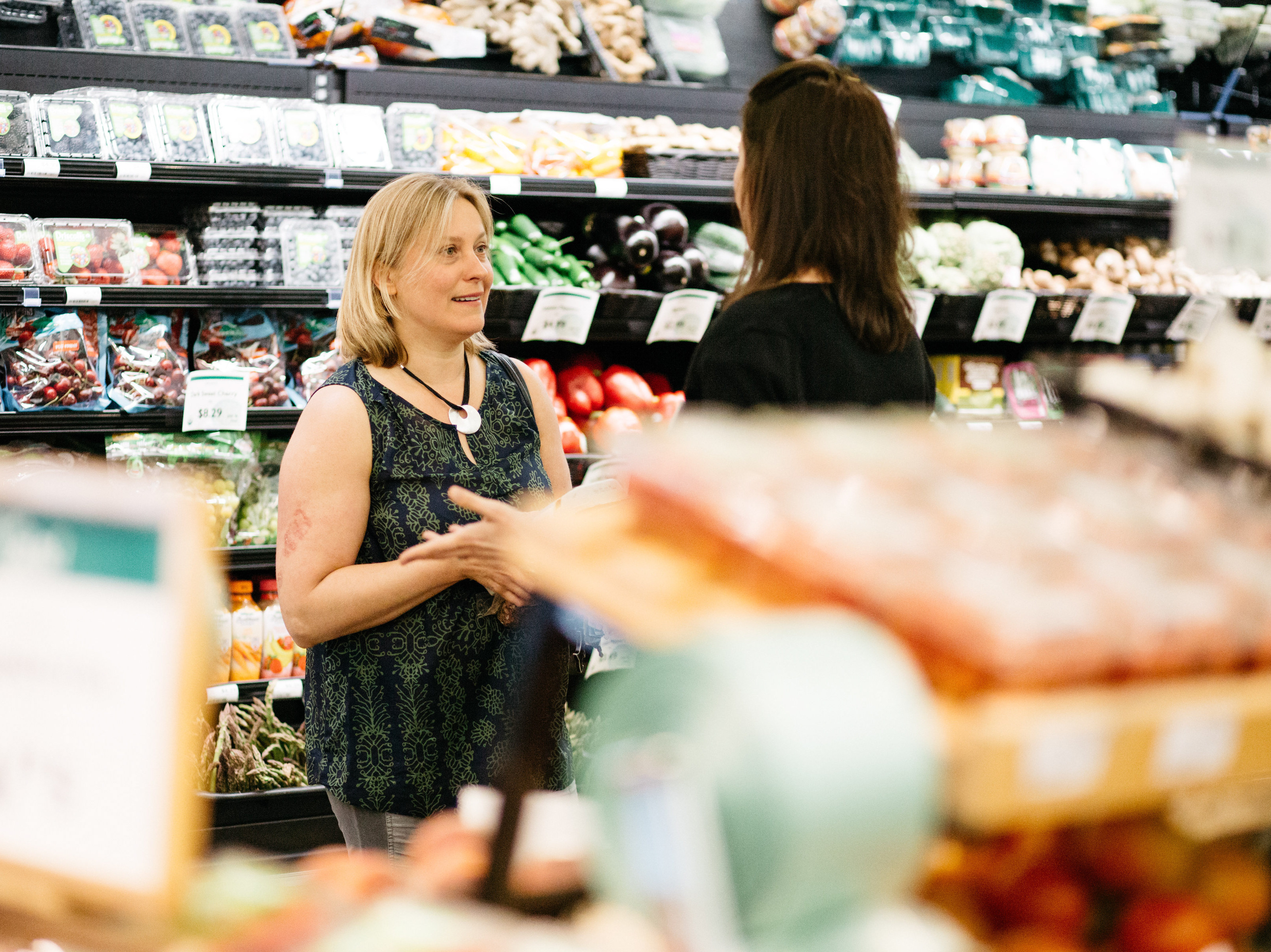
Researching a Grocery App
My client, Grocery Prime, is wanting to create a grocery store app to aid their customers in their shopping experience. My job was to conduct initial user research to determine specific problems or pain points that users have with grocery shopping. Their aim is for the app to solve these problems.
This project involved creating a user research plan with a goal and initial interview questions. I had to interview actual people for this project. I then went to my local grocery store and targeted those who were on their phones. I pulled them aside to ask my questions and record them. Aftewards, I analyzed their responses to narrow down one key pain point for my client.

User Test a Grocery App
Grocery Prime, as a result of the previous project, has put together a prototype of their app based on the feedback of the user research interviews. My task now is to complete usability tests with participants to confirm that the app makes sense. It is also my job to see if users are able to accomplish tasks necessary to order a grocery delivery. I had been supplied with a prototype and tasks to present the participants.
For this project, I took the Adobe XD Prototype out to the same local grocery store to find participants that matched my criteria. I learnt not to be afraid of approaching strangers and also not to take rejection to heart. Here, I performed usability tests with my participants to see if they can complete the task given to me by my clients. I noted down their interactions with the prototype and provided my client with my analysis.

Create a Brand Personality
My new client, Hunger No More, needs help creating content for their website to improve the overall user experience for their visitors. I was working on the homepage of this charity site aimed at fighting world hunger. I was given a wireframe of the home page, and my task is to add appropriate content to the page according to their specifications. I was also provided a list of their company values.
The most important part of creating and maintaining a brand personality is to complete a personality table to determine the personality of the brand. I also wrote out a short explanation of my table decisions to better describe it to my clients. I then expanded the provided wireframe to a medium-fidelity wireframe with content that matched the brand personality that was previously pulled together.

Iterating on Visual Design
My previuos client, the baking company, is happy with the first design and is back wanting more iterations of the wireframe. They want two extra iterations to experiement with some of their concepts, one that has a focus on photos of finished recipes, and the other that has a focus on social sharing.
I am very guilty of designing things once and making that the final design. From this project, I learnt that not all clients are happy with just one iteration, and that it's better off for me to design several to begin with regardless. This project also helped me stop and think about the UI/UX patterns that I integrate into my projects and why I do them.